What is it about middle gray?
I am teaching a series of workshops in Singapore. I had an “aha” moment during one of my recent classes. Purely by accident, I did what a good teacher is supposed to do. I took something that I knew well and I reconfigured that same information into a new format. The new approach made it so people who did not know the information could easily comprehend it. The expressions of “oh” and “aha” from my students showed me that I was on to something pretty useful for most photographers.
We were talking about how I think photographers should meter the light, not the subject, in order to get a good exposure setting. A good exposure setting (or meter reading) produces a good digital file and yields an image with the dramatic quality of light the photographer saw in the scene they were photographing. If the subject is darker (or lighter,) the fact that it reflects back less (or more) light is the thing that makes the photo so dramatic.
I tell students to start by looking for something that is middle gray that is in the same light as the subject they are photographing. They should use that as a starting point in figuring their exposure setting. I also point out how well-worn asphalt is middle gray. It usually is just the type of middle gray that all meters are programmed for. If you point a typical light meter at something white (or black) it will under (or over) expose that same thing because light meters are just dumb machines. They will leave whatever you meter off of middle gray if you just point the meter at the subject and use the given setting.
They loved the idea of well-worn asphalt as a nearly universal “gray card.” Then we were talking about what to use if there was no asphalt. I ran through a list of options including zebras (or football officials) both of whose alternating black and white stripes average out to middle gray in the “eyes” of most light meters. My wife, who is from India, has skin that is middle gray in tone, though not necessarily in color. In both cases the key is using a spot meter setting or filling the viewfinder with nothing but the middle gray tone in order to get the right reading. Then we went on to talking about the idea that some things can be middle gray in tone, though look quite different in terms of color.
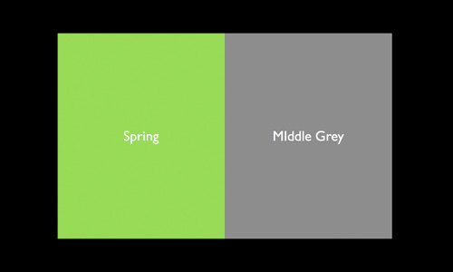
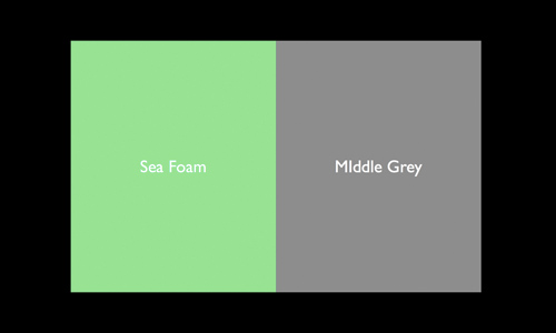
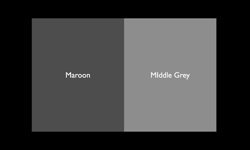
So as an experiment, I created the color sets that you see below. On one side of each set is a color and the other side is middle gray. The first three with the strong colors are especially interesting, to me.

That is because even though they look very different in color, once you take away that color, they are all three are remarkably similar in terms of tone. They are all very close to, if not exactly, middle gray in tone. To appreciate this idea, look at the color sets below. The color version is first and the gray scale one second.

After that you will see a couple other colors sets where the colors are in fact notably darker or lighter than middle gray.

Remember the color sets that you saw at the top of this blog entry? Here is what they look like without any color.

The way to really learn from this is to go out and photograph some things that you think are solid pieces of middle gray, in tone, though not necessarily in color. Photograph them so close that all you see are the colors. They do not even need to be in focus but they do need to be properly exposed. Then de-saturate them (remove the colors) so you have only gray. You may be surprised at how well (or badly) you do in finding things that are middle gray in tone (though not necessarily middle gray in color.)
As a photographer, knowing how to do this important. Sure, you can carry a gray card with you, but that is one more thing to carry and one more step to take in photographing. And yes, well-worn asphalt is a great thing to use in lieu of a gray card. But you cannot find well-worn asphalt everywhere in the world (which in some ways is a good thing!)


sorry in advance for this being so long:
just noting that achieving correct exposure and correct white balance are related but make different use of a “middle gray” or “neutral gray.” Achieving a correct exposure involves metering something that approximates 18% reflectance of visible light. The purpose of a traditional grey card is to have something which has a tonal value that reflects 18% of visible light.
David explains here how various known colors (in this case from whatever palette of colors David referenced) have the tonal quality equal to or close to “middle gray,” i.e. they reflect, approximately, 18% of visible light. David indicated that his wife (whom I’m hoping he didn’t marry only because she is a good exposure reference) has a skin color that approximates middle grey in tone. The bottom line is that the “middle gray” exposure reference does not have to be neutral (that is RGB 128, 128, 128) it just has to the same tone as middle gray as measured by the light meter.
On the other hand determining white balance is about measuring something in the image that actual middle, aka neutral, grey, i.e. RGB 128, 128, 128. Remember our digital cameras (with multi-million pixel image sensors) unlike film cameras are not really capturing a color image (film is composed of 3 layers of “emulsion” each of which is sensitive to Red, green or blue). Each of the pixels in the camera’s sensor is really digitally “measuring” levels of light (from 0-black to white-4096 in this example with 12 bit sampling). In bayer matrix filter sensors (which is basically all cameras except Sigmas with foveon sensors) some % of the pixels have a red filter in front of them so they measure the levels of red at those pixels on the sensor, and some have a green filter in front of them and some have a blue filter in front of them. The camera digital processing engine or lightroom or photoshop, do all the “processing and “computation” to yield an actual color image from all that measured data (from each of the millions of individual pixels).
Correct white balance, which results in an image that accurately represents the colors as they were observed in the actual scene, depends on the camera or the image processing software accurately determining what is “neutral gray” (RGB 128, 128, 128) in the captured image. Unless you carry a spectrographically neutral gray card around (such as whibal, mtapesdesign.com/whibal), which is inconvenient and ultimately pointless (in my humble opinion) in outside non-static lighting conditions, the only option to achieve reasonably correct white balance (and hence reasonably accurate color as observed when the image was shot) is to find objects or areas of the image that are reasonably neutral gray (such as asphalt, grey metal objects without highlights, people wearing grey shirts, mimes painted up as robots, etc) and tell the camera or the photo editing software to use that as the reference for determining white balance. This is easily done in photoshop or lightroom (or aperture for people of that religion).
One of the reasons to shoot raw images is because white balance can set and changed “on the fly” in the photo editing software. You just let the camera guess (which it might get right in some lighting conditions) and if it guessed wrong, you can adjust it after the fact in the editing software by selecting a part of the image to be used as the reference for “neutral gray”
Good thoughts…I think middle gray is a great concept but sometimes hard to get right in “color”. This helps!